navigating complexity

Arts model taxonomy. L2 view of the data model

A Level 1 and Level 2 view of the ARTS model, v4.01, based on concept decomposition, rather than overlapping data subjects.

It’s not fully written up yet, but here’s a pic for those interested in finding out more about my new approach to data architecture.

Powerful data tools you need now

I’ve decided to jot down some notes on some of the data tools installed on my laptop. A friend asked about my setup recently, so this will be a nice description I can refer him too as well.

cygwin – if you don’t know Unix you’re truly disadvantaged if you work with data. I love ‘nix, and can’t live without it.

gawk – you may laugh, but I use awk every day to hack data, it’s lightweight, fast and simple to use. Be sure it is installed with cygwin. Grab xgawk too, which is awk for xml files which makes for a great fast parser as well as doing other very handy things.

puttycyg – if you use putty, you absolutely must install puttcyg, it makes cygwin feel real. Honestly, without this I couldn’t use cygwin.

SQLyog – A terrific user interface for MySql. If you use Oracle, think Toad. Again, this is essential kit.

MySQL v5.0.67 – A great lightweight database I use for hacking data every day, super handy. Essential. Note I use this version for a very specific reason, the explanation for this is below.

RMySQL – R bindings for MySQL.  Allows you to pass data back and forth between R & MySQL very quickly, plus you can execute SQL statements and stored procedures from R.  Note – you need to be running a supported version of MySQL, like version 5.0.67 which you can get here.

R statistical software – I’m still learning R but finding it extremely powerful as a general purpose data tool. It’s graphical capabilities especially are extremely useful.

RExcel. This is really fantastic. It allows you data to pass between R and Excel very quickly, and to control R from Excel. Using this as a bridge to R, I’ve also been using this to integrate MySql and Excel too, which is awesome.

As an aside, RExcel comes with a  (D)Com server for R, so if you’re a com whiz you can use this to integrate your other windows projects with R too.

Graphviz – a declarative graph drawing language and visualization tool. I find this extremely useful to visualize data and to produce architectural drawings.

Generating Profiled Data

If you saw my very simple data profiling rules then you might want to try profiling some of your own data.

For the impatient, here’s a one liner in awk that will profile your comma delimited data. I suggest you load the output into excel. In excel you can put an autofilter on all your columns to play with the profiled data, and to start to zone in on rows with suspect quality.

awk -F, '{p = $0;gsub(/[[:lower:]]/,"a",p);gsub(/[[:upper:]]/,"A",p);gsub(/[[:digit:]]/,"9",p); o = $0 FS p; print o}' yourfile.csv

As you can see, it’s not all that hard to transform data into the simple data profiler specification using a little regex.  But what is hard :  running a continuous data profiling process, and thus a continuous data quality operation, within the context of existing ETL systems.

Why is this hard? Because the most of the expensive ETL tools people use at work do not support implementing that one line of regex very well, and once it’s executed, typically as a user defined function at the field level rather than at the row level, it’s often slow. Worse, this regex just doubled the number of columns under management in your ETL system. Doubling the number of columns = a double price tag in terms of configuration of your ETL system.

So, this is a good time to outline what exactly we need our continuous data profiling flows to do, written up as a list of problem statements and requirements.

That is the topic of my next post.

[The index for this series of articles is my data quality page.]

Tagged , , ,

Continuous Data Quality: Problem Statements

To develop an architecture and solution around continuous data quality, a great way to get started is to catalog the “Problem Statements.” These are descriptions of the business issues you are setting out to address.

From these problems, you can develop

  • more detailed business and system requirements
  • a solution architecture
  • the more granular system features you will need to set about building software.

As you read through the list below, you may wonder if these are representative of what people in the real world need. I have put these together based on years of experience, but it’s always good to validate.

Later, as a separate exercise I will map the final solution against the features used by Gartner in assessing the completeness of a Data Quality Software offering, and discuss the overlaps and omissions.

Problem Statements:

Below are high level problem statements describing the issues around a lack of a continuous data quality function that works effectively within the context of an ETL system.

From broad to specific:

  1. The automated data processing system does not produce 100% trusted outputs due to data quality issues. People are concerned with downstream impacts and confidence in the system is affected.
    1. ETL systems generally assume their data inputs are of high quality; and that attributes will be stable over time. These assumptions are largely incorrect.
      1. In many cases pre-known outliers exist that invalidate the general ETL rules, and a facility is needed that allows for these to be pre-processed (cleansed or rejected) selectively prior to general processing.
      2. Ideally the data values arriving need monitoring over time so the “drift” in the content of the data can be handled as new outliers are found.
    2. The practice of silently rejecting and discarding poor quality data fails to take into proper account the value this data has to the data supplier in guiding and instructing them on how they improve their data and processes.
    3. The error codes reported when data quality problems are found are not intuitive or instructive to the casual user or administrator of the system. Often when codes are finally found, researched and then understood, the investigator discovers they are not granular enough to resolve the problem without inspecting the raw data items directly.
    4. When investigating data item level errors the quality system doesn’t generate the information needed to quickly create and deploy a good data cleanse rule. The information generated about errors need to better characterise and generalise the problems so they are more manageable.
    5. Existing strategies around data cleansing do not generally provide the metrics needed to account for the value added in this step, or to determine if the cleanse rule was cost effective. i.e., was the effort in creating the rule offset by the cost savings produced by circumventing the quality problems? The return on investment (ROI) of the data cleanse effort, versus cost savings, or value add, are often largely unknown, and thus largely undervalued. Clear evidence of these would be very useful to encourage the development of effective cleansing strategies.
  2. File based data failures have resulted in system downtime. These are expensive and embarrassing. While hardware resiliency approaches are largely addressed, failures due to data problems (both content and configuration) are not. Several scenarios are outlined below.
    1. The presentation of a duplicated input file (possibly uniquely named) for bulk loading into most database and data warehouse loading programs will have had two effects, both resulting in outages:
      1. Either it is bulk loaded loaded and no errors are immediately reported, despite the error
      2. Or the load processes halts catastrophically as unexpected primary key violations throw errors not found in general testing of this unusual case.
      3. Both the above scenarios are bad for business:
        1. The first case implies downstream reporting systems are delivering wrong counts or wrong processing for the period prior to discovery. This typically results in a system restore from backup being needed, or bespoke delete work being needed.
        2. The second case means an incomplete load has possibly corrupted the database or has halted all data loading until the blocking data is resolved. This typically results in a system restore from backup being needed, or bespoke delete work being needed.
    2. The creation of an erroneously null file (a file with correct structure but containing no records) can affect all file types, including xml files. Where the process is to receive this data and derive “a delta”, aka updates, the business impact can be very high. The comparison process will invariably determine that all records held in the current system need deleting.
      1. The impact of this type of error cannot be emphasized more highly. While deletes of all your data is bad, the resolution is often to obtain a resupply of the data for reloading. Unfortunately this reload can generate transactions on the destination system with a volume far higher than normally expected. The impact of this can be catastrophic on transactional downstream systems . I have often seen this “foul weather” scenario knock over ESB and messaging based systems, or worse, grind them to a halt as they struggle with the volumes which create backlogs that can take days to clear.
    3. Another problem similar to null files, is file truncation, which is another hard-to-spot source of data loss with difficult to resolve consequences.similar to those effects associated with null files.
      1. File transfers of flat delimited data are a common way to move large volumes of structured data, but file truncations and corruptions are a problems. A source of this problem is that file generation and file transfer processes need to be assessed together from a continuous quality perspective rather than separately, as a failed data generation process are creating truncated files, and then independent monitoring processes are pick up these partial files up, considering them completely written. The file transfer processes then distribute the truncated files

These are challenging problems, and I am sure there are more. If you have one to add please do so using the comments.

[The index for this series of articles is my data quality page.]

Tagged , , , ,

How to Profile Data

There is a little secret to data profiling that is ages old but that no one seems to get taught anywhere. While there are lots of overcomplicated alternatives, let me explain a dead simple but extremely effective profiling rule:

  • Swap all capital letters in your data for the letter “A”
  • Swap all lower case letters for “a”
  • Swap all numbers for “9”
  • Leave all other characters in the raw data unchanged

This simple transformation will convert a list of phone numbers as follows:

  • “1 (416) 123-5432” becomes “9 (999) 999-9999”
  • “+44(0)7970 123123” becomes “+99(9)999 999999”
  • “+33 2 31 11 22 33” becomes “+99 9 99 99 99 99”
  • “1-416-123-9876 ext. 123” becomes “9-999-999-9999 aaa. 999”

You can see that in different countries, Canada, the UK and France, the presentation of a phone number is quite different.

If you summarize the millions of phone number records you have, you could expect to find a thousand or so phone number formats in your data, some with very high frequencies, and others that are outliers – meaning they have very low frequency counts.

The last phone number example shows what most likely will be seen as a common outlier in your customer data: the use of an extension number in the telephone data.

What about we look at some results for a less structured field of data? Something messy?

Below I present a data profile frequency report for the Given_Name field in a test system, where we can demonstrate the data quality controls are poor and need correction prior to the system going live. First is the report, then far down below the interpretation:

Top 250 Format Frequency Analysis of Column Given_Name

=======================================================

max string length:  25
raw cardinality:  9057
format cardinality:  146

count format
===== ======

3300 aaaa_999_9
1258 aaaaaa9aaaaa99999
810 aaaa_99_9
757 Aaaaaa
724 Aaaa
720 aaaaa_99_9
651 Aaaaa
568 Aaaaaaa
561 AAAA
447 Aaaaaaaa
382 aaaaaa9aaaaa9999
270 Aaaaaaaaa
138 Aaa
120 AA_AAA
120 AAAA_AAA_AAA
98 aaaaaaa
93 aaaaaaaaaaa99999
92 AA
90 aaaaaaaaaaa9999
89 aaaaaaaa
89 aaaa_9_9
86 AAaaa9
83 AAA
80 aaaaa_9_9
80 Aaaaaaaaaa
77 AAAAaaa9
72 Aaaa Aaaaaaaaaaa 9
72 Aaaa Aaaaaa 9
69 aaaaaa
69 AaaaaAA99
67 AaaaAaaa
60
58 aaaaaaaaa
58 aaaaa
56 aa9
52 AaaaAaa
51 aaaa
45 aaaaaa9aaaaa999
44 aa99
44 AAaaa99
44 AAAA99
42 aaaaaa9aaaaaaa999
40 AAAA-9999
40 AAA999
36 aaaaaa9aaaaaaa999 aaaaaa
36 Aaaa99
36 AAAAAAA-99
27 aaaaaa9aaaaaaaa999
23 Aaaa9
20 Aaaaaa99
19 Aaaaaaaaaaa
19 AAA99
18 aaaa99 aaaaa
18 AaaaaAA9
16 aaaaaaaaaa
16 aaaaaa99 aaaaa
16 AaaaaAaaa99
16 AAAAAAA
14 aaaaa99 aaaaa
14 aaa
14 Aaaaaaaaaaaa
13 aaaaaaaaaaa
12 aaaa_aaaaaaaa_aaaaa
11 Aaaaaaaaaaaaaa
11 AAAAAAAA99
10 aaa99
9 aaaaaaaaaaa999
9 aaaa99
9 AA9
8 aaaaAa
8 Aaaa Aaaaaaaaaaa 99
8 Aaaa Aaaaaa 99
8 AAAAaaa99
8 AAAAAAAA
7 Aaaaaaaaaaaaaaaa
7 Aaaaaaaaaaaaa
7 Aaaaa9
7 AAA9
6 aa.aaaaaaaa99
6 AAAAA
5 AaaaaaAaaa
5 Aaaaaa9
5 AAAAAAA9
4 aaaaaa9aaaaaaa9999 aaaaaa
4 aaaaaa9aaaaaaa9999
4 aaaa_aaaaaaaa_aaa
4 aa-aaaa
4 Aaaaaaaa.Aaaaaaaaaaaaaaaa
4 Aaaa Aaaaaaaa
4 Aaaa Aaa
4 AAAAAAAAAAAAA
4 AAAAAAAAA
4 AAAAAAA99
4 AA 9.9 AA Aaaa9 AA
4 A
3 aaaaaaaaaaaa99
3 aaaaaa9aaaaaaaa9999
3 aaaaaAaaaa99_99
3 aaaaaAaaaa99_9
3 aaaa_aaaa_aaaaa
3 Aaaa-Aaaaaaaa
3 Aaaa-Aaaaa
3 Aa
3 AAAAAA
3 AA99
3 AA 9.9 AA Aaaa99 AA
2 aaaa_aaaaaaaa_aaaaaa
2 AaaaaAaaaA
2 Aaaaa999
2 Aaaaa99
2 AaaaAaaaaa
2 AaaaAaaaa
2 Aaaa-aaaa
2 Aaaa-Aaaa
2 Aaaa-Aaa
2 Aaaa Aaaaa
2 AAAAAAAAAA
2 AAAAAAAAA99
2 AAAAAAAAA9
2 AAAAAAAA9
1 aaaaa-aaaaaaa
1 aaaa_aaaaa_aaa
1 aaaa_aaaa_aaa
1 aaaa-aaaaaaaa
1 aaaa-9-9
1 AaaaaaaaaAaaaAaa
1 Aaaaaaaaa,
1 AaaaaaaAaaaa
1 AaaaaaaA
1 Aaaaaaa-aaaa
1 Aaaaaaa-Aaaa
1 Aaaaaaa A
1 AaaaaaAaaaaaaa
1 Aaaaaa Aaaa
1 Aaaaa.
1 AaaaAa
1 Aaaa-Aaaaaaaaaa
1 Aaaa-Aaaaaaa
1 Aaaa Aaaaaa
1 Aaaa Aaa Aaaaaaaaa
1 Aaa9
1 Aaa-aaaaa
1 Aa-aaa
1 AAAA9
1 AA AAaA Aaaaaaa9
1 AA 9.9.999 AA Aaaa9 AA

Interpretation:

1) please realize you just eyeballed the data quality profile for almost 10,000 items of raw data in a field called given_name.  The report has summarized this into just 146 formats. That’s a great compression ratio for an unstructured field of data.

2) Do you know anyone with a number, a comma, or an underscore in their given name? I don’t. It’s clear we’re seeing a lot of test users in this system with names like tester01 tester02. Are there no data quality controls on the collection of this data? Just looking down this list lowers my expectations for the how this data can be consumed.  Interestingly I’ve heard people had expectations they would use this field to personalize email campaigns. Sounds like it’s time to reset some expectations with the marketing team.

3) Why are there 60 null values in this data? Maybe we should advise someone that given name should be a mandatory field of data?

4) There are 92 names with the format AA, and another 3 with Aa. This is a little tricky. I do have a friend called Ng, and another called AJ. I’m also friends with a PJ and a JP. Here we need to examine the specific cases to build up either a white list of acceptable two-character names, or conversely, a black list of strings we won’t accept like, XX.

5) There’s an example of “Aaaaaaaaa,” where a trailing comma is in the data. Seems easy to do if you are copying and pasting the data from somewhere else… but don’t generally you see “surname, givenname” rather than “givenname, surname”? We should have a look at the raw data in these cases to see whether that really is a given name in the field, and not a surname.

I think you’re getting the idea.

In the next in this series of articles I’ll explain exactly how you can generate these format reports.

[The index for this series of articles is my data quality page.]

Tagged , ,

Continuous Data Quality: Business Requirements

Automated data processing is not all about how many machines you can throw at the problem. Data quality is a threat to any size operation. Integrating a data quality engine into your process is important if you need long term credibility, so below, is a list of high level requirements that support the problem statements in my last post.

Business Requirements:

  1. The automated ETL system should always produce trusted and robust outputs, even under conditions of variable file, record and data item quality.
  2. As quality failures can be detected at many levels of granularity, so too must the quality monitoring: so at file, message, record and data item levels
  3. To establish trust, all system inputs and outputs require a minimum level of data quality assessment to ensure that expectations set around data quality are met. These can be characterized by the principle of “Entry and Exit criteria checking.”
  4. If the input data quality changes through “drift”, error, or by design, the system should be able to handle these on-going situations in an agile manner that’s adaptable .
  5. Data points failing to meet expectations should be tagged as such, and should be made available for inspection and reporting.
  6. Enough information shouldbe collected about quality failures to describe, trace, and resolve the source of the issue
  7. Where data cleanse rules alter inputs or create data, these must be tracked and reported
  8. All data moving through the system must be traceable proving no data was unknowingly lost or introduced, and the provenance of all outputs is clear
  9. All file transfers in and out of the system must be wholly resilient in the face of machine, network and process failure
  10. Duplicate data files created through error must mitigated against in all cases
  11. Error codes should be directly interpretable, rather than requiring lookup in a dictionary.
  12. Rules to resolve data quality issues should be applied at the same level as the tagging of data quality problems
  13. the system should attempt to resolve a data resupply unaided by humans when files arrive that fail entry criteria checks
  14. data quality checks of many kinds are needed on individual and composite raw data fields:
  1. uniqueness checks
  2. format and data type conformance
  3. range constraints
  4. dictionary conformance
  5. character filters
  6. null constraints
  7. check digit verification

[The index for this series of articles is my data quality page.]

Tagged , , , , ,

Data State Transition Diagrams

The problem with data flow diagrams is they only convey how data flows, not how well data flows. To fix that, I’d like to present a new type of diagram called a Data State Transition Diagram.

This is a diagram that helps you simplify and optimize data flows. The idea is based on an analysis technique conceived by Chris Wensel of Cascading that he described in an article called “The distance between simple and complex”. It is one of the best articles about simplifying data processing I’ve ever read.

Chris suggests data goes through 4 logical types of transitions as it flows in any system, and these state transitions can each be scored.  The core data transitions he proposes are:

  • Model Transitions – the conversion of data from one meta model to another (ie from xml to csv, or normalised to denormalised)
  • Value Transitions – the creation of new data via value added business rules
  • Phase Transitions – the reading or writing of data between dynamic memory and static persistent storage
  • Location Transitions – the transfer of data between locations.

Through assigning costs to data transitions, he calculates the complexity cost of a data flow. Reducing the cost = reducing the complexity. He expertly observes that overly complex flows have early redundant steps which generate downstream compensation actions. In these cases the simplification is to remove the early redundant action, as well as the compensatory ones correcting for it downstream.

This idea is really big: Chris has produced a framework for scoring data flow complexity as a way to find simplifications. Chris says it perfectly:

Simplicity is about subtracting the obvious, and adding the meaningful.

My own contribution has been to turn this analysis into a drawing. I propose it because knowing how to simplify a data flow is not enough. You need to sell the idea, and to do that you need to communicate the simplification ideas to decision makers effectively.

A data state transition diagram has four swimlanes representing the four types of transition.  Each step in the flow is a numbered box describing the transition going on, and these are joined by arrows denoting the sequence of states the data goes through.

This diagramming approach results in a visual representation that shows where your system is spending its energies, and how you can simplify and reduce the costs of the flows while achieving the same value.

Below is an example diagram clearly highlighting a poor data flow design. The original pdf version is available through this link:  DataStateTransitionAnalysisExample

Simplify your data flows using Data State Transition Diagrams

Discover how to simplify your data flows using Data State Transition Diagrams

Assessing the usefulness of the diagram:

In my workplace, the people who fund simplification programs want to “see” the opportunities for simplification before committing funds to them.

These are mostly programme managers who ultimately decide how to invest resources to achieve a business goal. As such, they aren’t necessarily all that technical, and they don’t have a lot of time or desire to study hundreds of pages of detailed technical analysis.

But they may have time to glance at a good diagram. And after all, it’s pretty pictures that sell ideas, right?

Tagged , , , , , , ,

Introducing the Systems Landscape

What is a system landscape?

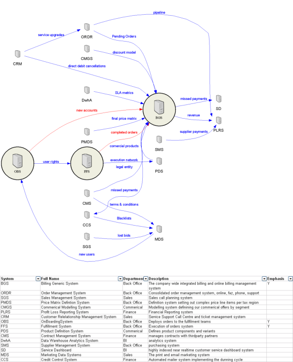
A “system landscape” is a special kind of schematic diagram developed for large enterprises.  It’s purpose is to record the dependencies between systems in terms of the transfer and distribution of master data entities. Diagrammatically it’s a simple graph diagram, showing as nodes the logical systems operating in the enterprise, and as edges the interface connections and master entities transfered between them.

It sounds simple, but these are diagrams rarely available in the largest and most complex companies out there.

Below is a made up example generated by me for a generic company. This particular one is very simple, having a small number of nodes and edges. Large companies can expect to have hundreds of source systems connected in god knows how many ways. Blue lines represent existing flows between systems, red lines the proposed ones.

System Landscape Diagram

Dependency mapping the systems in an enterprise.

What’s so great about this diagram?

Its simplicity is disarming, but these diagrams radically improved my performance as an architect. That’s because these diagrams are designed to alay the cultural fears and barriers to change that are very real in large and messy enterprises.  The fear is  that “you can’t change anything, or you’ll break everything.”  When I first heard that spoken, it occured to me this was an information problem. Creating a systems landscape diagram addressed this information gap, and helped turn me into a credible agent of change, despite being the new guy. With it, I could respond to these fears in a methodical and rational way. “No, I won’t break everything, just possibly 12 things. So lets engage with those teams now and include them in planning of this change.”

Then later, each time an old timer explained how my proposed changes would break something else downstream I’d not known about, I’d add these new dependencies to the diagram.  Because the knowledge was accumulative, soon all the known dependencies were identified after a short time I could move to solving real problems instead of defending myself.

It wasn’t until much later, after I had mapped the entire enterprise in this iterative fashion that I realised the document was extremely useful for radically altering the entire culture of a large company. Everyone wanted a copy of the diagram and it was clear why.

A system landscape diagram demonstrates to everyone that your giant organisation X is “knowable” and more specifically, that you know it. This alone turns your project proposals to change/fix/alter existing architecture from a discussion about what you might break and how crazy your ideas are, into a discussion on how you will negotiate the dependencies on other people and systems succesfully. This is a massive leap in attitude if you’ve ever tried to implement big changes in a big organisation.

Mechanically speaking, these diagrams are easy to generate automatically using graphviz from a spreadsheet – so it is thus easy to keep up to date. This single factor makes these documents “living”. It also means that it is easy to generate collaboratively. Stick the spreadsheet in subversion or in sharepoint, and let everyone contribute to its upkeep.

Tagged , , , ,

What’s a bytefreq?

In large data analysis agencies you may hear people mention “freqs”.

These are frequency reports or data profiling reports that show the frequency counts of specific values held in a field. These are really handy things. You want to create a database table with the right field lengths for example? Just run a format freq on the input data to discover the cardinality of the data, and it’s characteristics like max length along with a histogram of the typical values so you can identify outliers etc.

A more specialised type of freq, is a bytefreq. You won’t hear about these often, and no one has code to generate these much except people who roll their own up (like me).

The idea of the bytefreq is this. Imagine receiving two or three thousand files a month that you load to a datawarehouse for example, but data suppliers never bother to send you the file specification details, and they aren’t sending you xml.  So you need ways to try and discover the file spec. How many fields are in the file? What code page is the file? What field separators are in use?

How do you discover these answers without picking up the phone? You write some code that reads the file byte by byte, and then it calculates a histogram for each byte in the file. You then print this frequency data laid out as a matrix with some common code pages presented alongside the hex values so it becomes human readable.

But, how does a byte-by-byte historgram of the file help you?

Well, the point of the bytefreq is simple. If someone sent you a file with both line feeds and carriage returns, you’ll see a high count for both these bytes, and mostly these  counts should be equal. If the file came with only line feeds however, you’ll see high counts for line feeds, but not for carriage returns. If the file is comma delimited you’ll see a high count for that byte, versus say other candidate characters like pipes or tabs. The code page of the file is also very easily seen using these bytefreq reports, a large spread of counts below 128 and the code page is probably standard ascii. A smattering of diacritics, and it’s probably extended ascii. A file with almost all high ascii byte counts is invariably some form of EBCIDIC data.

Anyway – the bytefreq is a highly specialised datafile analysis technique, and I’ve named my blog after it, because bytefreqs represent innovative analysis of data. And it sounds cool too.

Tagged , , ,