Tag Archives: diagrams

Data State Transition Diagrams

The problem with data flow diagrams is they only convey how data flows, not how well data flows. To fix that, I’d like to present a new type of diagram called a Data State Transition Diagram.

This is a diagram that helps you simplify and optimize data flows. The idea is based on an analysis technique conceived by Chris Wensel of Cascading that he described in an article called “The distance between simple and complex”. It is one of the best articles about simplifying data processing I’ve ever read.

Chris suggests data goes through 4 logical types of transitions as it flows in any system, and these state transitions can each be scored.  The core data transitions he proposes are:

  • Model Transitions – the conversion of data from one meta model to another (ie from xml to csv, or normalised to denormalised)
  • Value Transitions – the creation of new data via value added business rules
  • Phase Transitions – the reading or writing of data between dynamic memory and static persistent storage
  • Location Transitions – the transfer of data between locations.

Through assigning costs to data transitions, he calculates the complexity cost of a data flow. Reducing the cost = reducing the complexity. He expertly observes that overly complex flows have early redundant steps which generate downstream compensation actions. In these cases the simplification is to remove the early redundant action, as well as the compensatory ones correcting for it downstream.

This idea is really big: Chris has produced a framework for scoring data flow complexity as a way to find simplifications. Chris says it perfectly:

Simplicity is about subtracting the obvious, and adding the meaningful.

My own contribution has been to turn this analysis into a drawing. I propose it because knowing how to simplify a data flow is not enough. You need to sell the idea, and to do that you need to communicate the simplification ideas to decision makers effectively.

A data state transition diagram has four swimlanes representing the four types of transition.  Each step in the flow is a numbered box describing the transition going on, and these are joined by arrows denoting the sequence of states the data goes through.

This diagramming approach results in a visual representation that shows where your system is spending its energies, and how you can simplify and reduce the costs of the flows while achieving the same value.

Below is an example diagram clearly highlighting a poor data flow design. The original pdf version is available through this link:  DataStateTransitionAnalysisExample

Simplify your data flows using Data State Transition Diagrams

Discover how to simplify your data flows using Data State Transition Diagrams

Assessing the usefulness of the diagram:

In my workplace, the people who fund simplification programs want to “see” the opportunities for simplification before committing funds to them.

These are mostly programme managers who ultimately decide how to invest resources to achieve a business goal. As such, they aren’t necessarily all that technical, and they don’t have a lot of time or desire to study hundreds of pages of detailed technical analysis.

But they may have time to glance at a good diagram. And after all, it’s pretty pictures that sell ideas, right?

Tagged , , , , , , ,

Introducing the Systems Landscape

What is a system landscape?

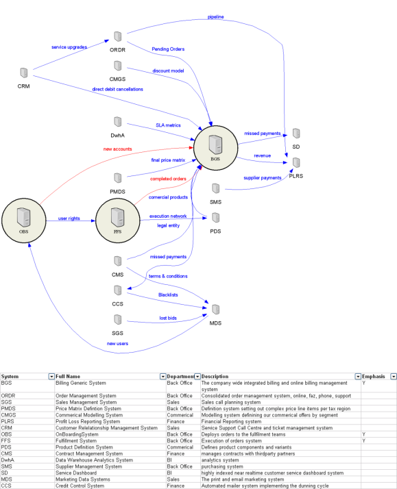
A “system landscape” is a special kind of schematic diagram developed for large enterprises.  It’s purpose is to record the dependencies between systems in terms of the transfer and distribution of master data entities. Diagrammatically it’s a simple graph diagram, showing as nodes the logical systems operating in the enterprise, and as edges the interface connections and master entities transfered between them.

It sounds simple, but these are diagrams rarely available in the largest and most complex companies out there.

Below is a made up example generated by me for a generic company. This particular one is very simple, having a small number of nodes and edges. Large companies can expect to have hundreds of source systems connected in god knows how many ways. Blue lines represent existing flows between systems, red lines the proposed ones.

System Landscape Diagram

Dependency mapping the systems in an enterprise.

What’s so great about this diagram?

Its simplicity is disarming, but these diagrams radically improved my performance as an architect. That’s because these diagrams are designed to alay the cultural fears and barriers to change that are very real in large and messy enterprises.  The fear is  that “you can’t change anything, or you’ll break everything.”  When I first heard that spoken, it occured to me this was an information problem. Creating a systems landscape diagram addressed this information gap, and helped turn me into a credible agent of change, despite being the new guy. With it, I could respond to these fears in a methodical and rational way. “No, I won’t break everything, just possibly 12 things. So lets engage with those teams now and include them in planning of this change.”

Then later, each time an old timer explained how my proposed changes would break something else downstream I’d not known about, I’d add these new dependencies to the diagram.  Because the knowledge was accumulative, soon all the known dependencies were identified after a short time I could move to solving real problems instead of defending myself.

It wasn’t until much later, after I had mapped the entire enterprise in this iterative fashion that I realised the document was extremely useful for radically altering the entire culture of a large company. Everyone wanted a copy of the diagram and it was clear why.

A system landscape diagram demonstrates to everyone that your giant organisation X is “knowable” and more specifically, that you know it. This alone turns your project proposals to change/fix/alter existing architecture from a discussion about what you might break and how crazy your ideas are, into a discussion on how you will negotiate the dependencies on other people and systems succesfully. This is a massive leap in attitude if you’ve ever tried to implement big changes in a big organisation.

Mechanically speaking, these diagrams are easy to generate automatically using graphviz from a spreadsheet – so it is thus easy to keep up to date. This single factor makes these documents “living”. It also means that it is easy to generate collaboratively. Stick the spreadsheet in subversion or in sharepoint, and let everyone contribute to its upkeep.

Tagged , , , ,